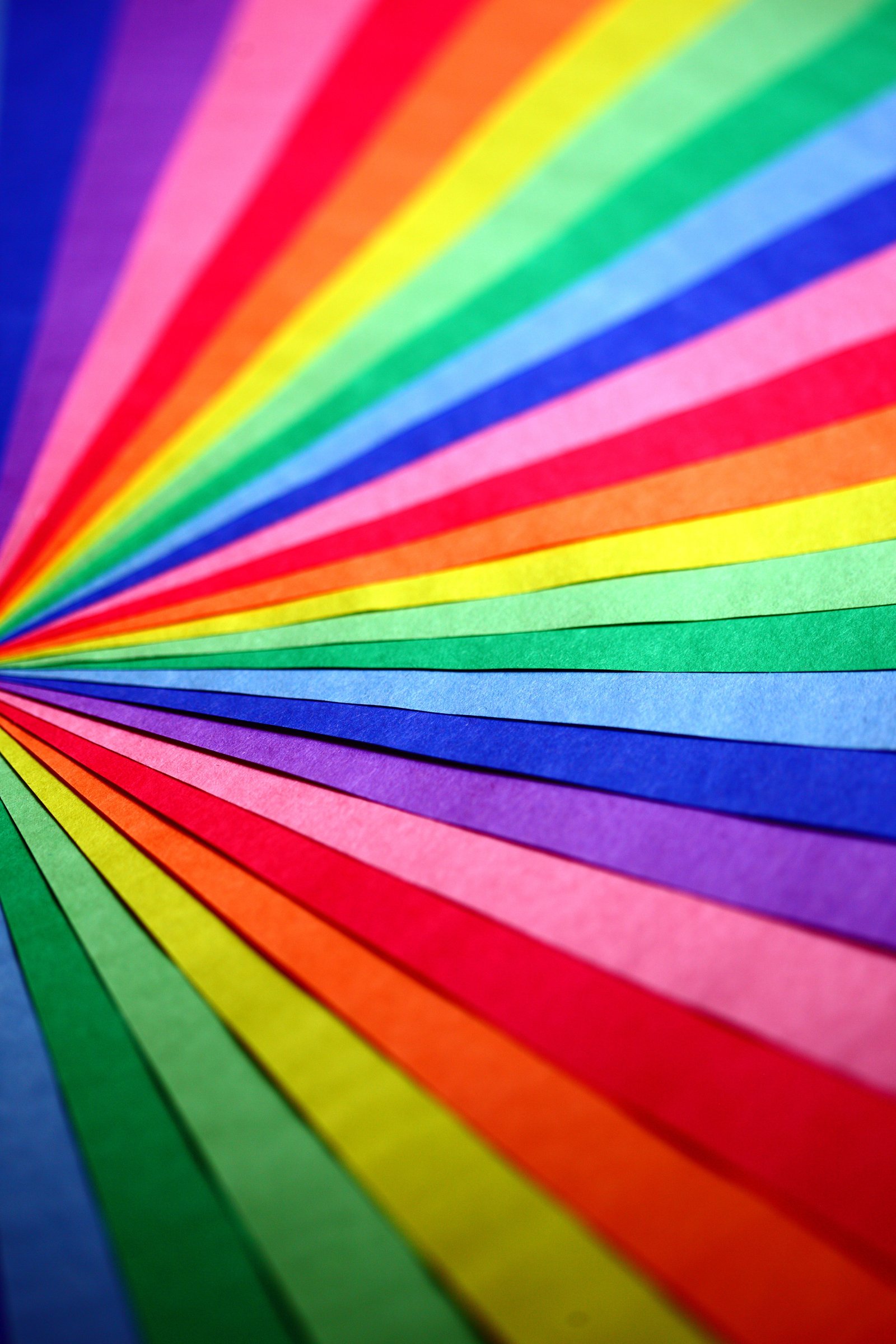
The Power of Color Psychology: Elevating Visual Communication in Graphic Design
Color is far more than an aesthetic choice; it is a subconscious communication tool that dictates how viewers interpret, feel about, and react to visual content.
Introduction: Color as a Strategic Design Element
In graphic design, every element—from typography to spatial layout—serves a defined communication goal. However, color possesses an instantaneous visual impact that reaches the viewer long before they read a single line of text. Mastering color theory and color psychology is essential for creating compelling branding, effective UI/UX design, and impactful promotional media.
1. Why Color Psychology Matters in Visual Communication
Visual communication relies on conveying messages quickly and memorably. Colors trigger subconscious emotional responses rooted in biological instincts, cultural associations, and personal experiences.
Direct Subconscious Messaging
When a user visits a website or picks up a printed brochure, specific color combinations immediately set the emotional tone. Strategic color selection helps guide user emotions, whether the goal is to induce calm, evoke urgency, or inspire confidence.
Enhancing Information Retention
Studies show that human memory is strongly linked to visual stimuli. Using intentional color choices improves brand recognition and allows audiences to process and retain information significantly faster.
2. Core Psychological Associations of Primary and Secondary Colors
Understanding universal color associations allows designers to choose palettes that align precisely with project objectives.
Red: Energy, Urgency, and Passion
Red commands attention and stimulates physical excitement. It is widely used in call-to-action (CTA) buttons, clearance sales, and food branding due to its ability to induce appetite and quick decision-making.
Blue: Trust, Security, and Professionalism
Blue evokes feelings of stability, dependability, and calm. Consequently, it is the dominant color choice for financial institutions, healthcare organizations, and tech enterprises seeking to establish corporate trust.
Yellow: Optimism, Clarity, and Caution
Yellow conveys warmth, positivity, and energy. However, because of its high visibility, it must be balanced carefully to avoid visual fatigue or associations with warnings.
Green: Growth, Nature, and Balance
Green is strongly associated with vitality, sustainability, health, and wealth. Brands focusing on eco-friendly solutions, organic products, or financial growth routinely leverage green palettes.
3. Strategic Color Application in Branding and UI/UX
Applying color psychology effectively requires balancing artistic intuition with functional design principles.
Establishing Brand Identity and Differentiation
Selecting a primary brand color defines how a company presents itself in competitive markets. Consistency across logos, websites, and marketing collateral builds strong brand equity over time.
Creating Visual Hierarchy and Accessibility
In digital product design (UI/UX), color directs user navigation. High-contrast accent colors spotlight primary actions, while neutral tones organize secondary content, ensuring the interface remains accessible and easy to navigate.
Conclusion: Mastering Color for Better Design Outcomes
Key Takeaway: Intentional color choices transform simple visual assets into powerful communication tools, allowing graphic designers to craft meaningful, high-converting experiences.
By studying how colors evoke specific psychological reactions, designers can elevate their creative work from purely aesthetic layouts into purposeful visual solutions.